--CTF-Molten (Unreal Tournament 4)--
#leveldesign
Unreal Tournament 4
Imgur Gallery
Map Direct Download Link
UT Forums Project Link
Over the past couple of months I have been developing a new custom Unreal Tournament 4 map with the intention of focusing on my favorite weapon in the game, the flak cannon. I really enjoy the flak cannon because the pellets reflect off of meshes in the game. I also really wanted to theme my map with fire or lava.
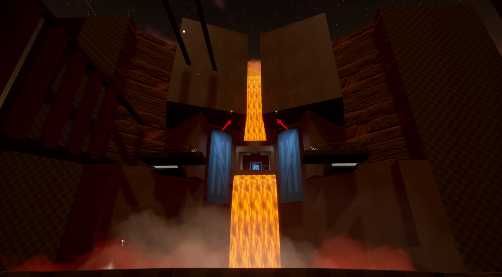
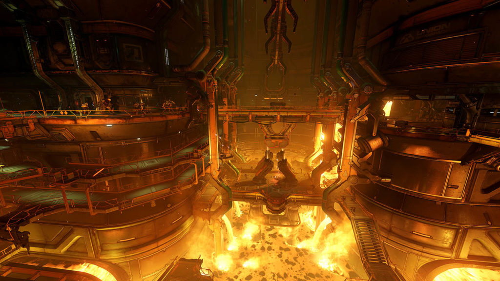
This is an image that I am using for reference in terms of architecture and somewhat for layout as well as lighting. (DOOM)
What I like about the above reference is that it uses a highly vertical design, with multiple levels on a single structure. While Unreal Tournament doesn’t necessarily play the best on very vertical environments, I feel that I can alter the layout to better fit the gameplay style Unreal Tournament feels best in. An initial idea is to block vision at higher angles from below to higher levels at small distances. This will give a wider playing angle at longer distances, while preventing players from killing others at steep angles from below.
I initially started with blocking out a fort for one side as well as interesting areas for combat that could be pieced into the level.
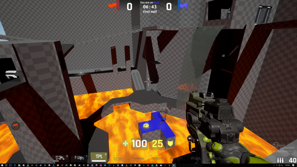
This is a basic block of what I have come up with initially. Striving for environmental hazard and strong landmark locations that are easily identifiable. I have found that designing unique landmarks with the geometry allows players to easily understand where they are at any given point in relation to each other. This is somewhat modeled after the map DM-Deck16II.
I have also measured out distances between certain pieces of geo to allow for dodge-jumping transitions, mainly the flag area.
After running around the geo myself and checking view angles and distances, I figure that this as is obviously will not play well because of the steep view angles. There is also the issue of non-circular play where players are unable to get in the flow of running around and an area of interest without drastically changing their location to get to their destination that is nearby.
After talking the idea out of some fellow designers, a neat idea came up. To have rotating towers in the middle of the level as a means to get through to take, and capture the flag. I really liked this idea, and wanted to try to implement it and get a prototype working quickly.
This is what I was able to come up with for the newly named “Meat Grinder”. The idea is that players would enter from the bottom and work their way up to the top to exit to the other side of the map. The rooms inside would be close quarters and allow for a lot of flak cannon usage.
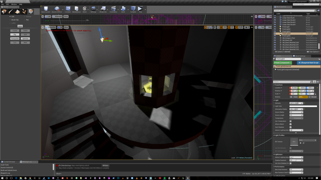
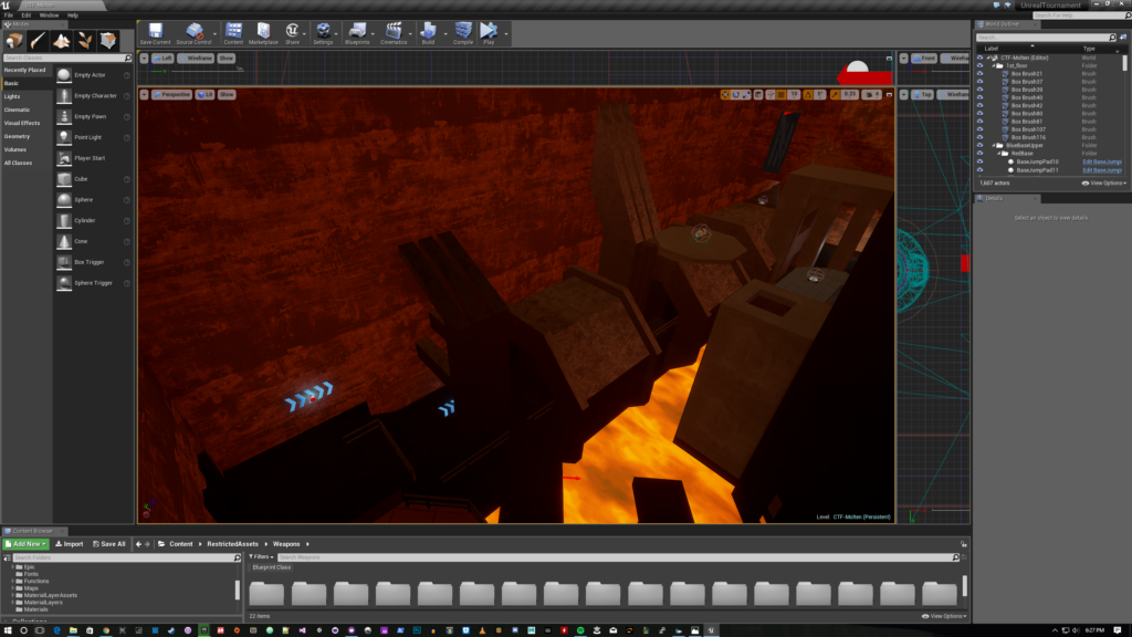
Here is a badly lit image of what I wanted the second floor to look like in terms of geo, and traversal.
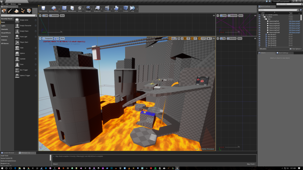
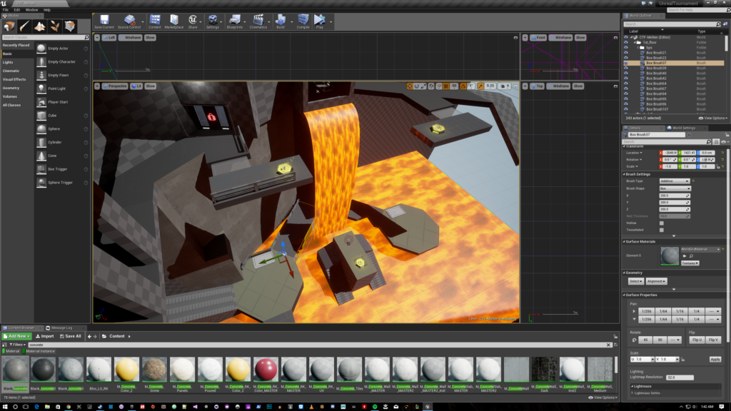
I have made the upper level involve more circular play by adding the jump pads to navigate across the side of the fort, and lifts that automatically cycle to the top.

I then wanted to try to get across the mood by picking out of the materials that exist in the UT asset list, and adjusting the skybox lighting to achieve this look.
The problem of the steep viewing angles still exists at this point. Additionally, a new issue that has come up in playtesting: lots of waiting around for entrances to the tower, and lifts.
In a later build I made an attempt to address the steep viewing angle by making the higher up areas more open to long range fire, but large enough to avoid fire from below. This indirectly forces a larger viewing angle by having players find a longer distance to shoot from, or to move to their vertical height using a lift or translocator. In addition to this I have effectively divided the map into three core areas of interest.
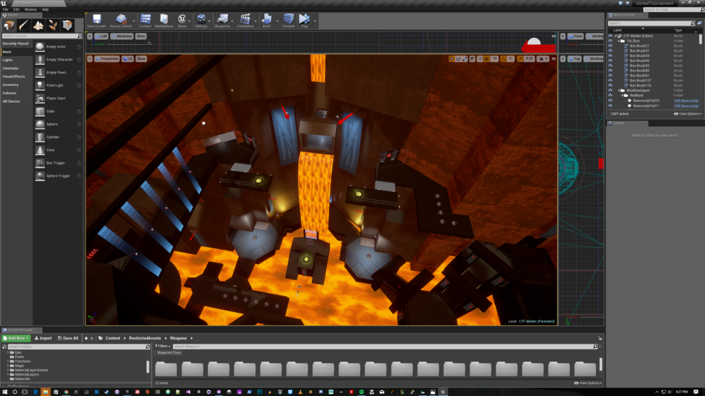
First up, the fort. This area has vertical style combat, along with long range combat in the higher up areas. This area is divided up with the middle area acting as a wall. This area is mirrored to the other side.
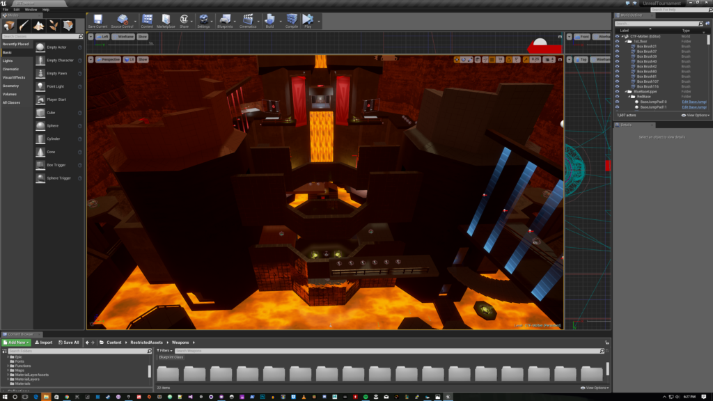
These two towers block the long range viewing angles at lower elevations and prevent sniping at opposing flag areas.
Finally, this pipe area acts as a longer, more indirect connector to the opposing forts. This area is mirrored on the other side of the map.
The fort areas of the map have been adapted to have combat “bowl” style interactions between players. Players will often maneuver between elevations quickly using the lifts, translocators, teleporters, and geometry. After making much needed fixes, playtesters feel that the map flows well, however there are issues with the rotating towers in the middle. Mainly action being too slow in the middle of the map, which goes against the design intention of the middle.
To fix this I have made multiple modifications to the rotating system, and geometry to make gameplay faster.
1.I added buttons above doors, and to certain areas on the rotating entrance. Shooting a button will rotate a door to the buttons previous location. This effectively adds another door to the structure. These appear on both the inside and outside of the structure for entrance, and exit needs.
2.Changed the geometry of the bottom floor rotator to have a door that spans more than one rotation. This allows for players to get into the tower and not have to redirect their destination because the wall rotated when they weren’t expecting.
3.Finally, I sped up the cycle of rotation significantly.
These changes made the towers feel significantly better. I am going to continue playtesting and iterating to make this map better!
One note on moving environments in an online setting. You must make sure to include measures to have the server handle the movement of the geometry, and sync it to the clients. If you do not do this you will have collision differences between the client and server which in my case, caused doors to appear, but the collision of a wall to be there under the hood. This was very bad. A good way to test this un UE4 is to change the play mode to “Use Dedicated Server”. This will emulate the effects of playing online, however, I noticed some slight differences using this method and actually playing on a server.
Here is the forum post of the map on the UT4 level design forums where you can read the patch notes and download the map. Enjoy!
