
--Learning From CTF-Molten--
#leveldesign
Creating this map was a ton of fun, but also an amazing learning experience. My intent from the beginning of the project was to completely finish a map, all the way from whiteboxing, to adding details in the map from already available assets. I wanted to get a taste of all aspects of map development from start to finish for Unreal Tournament, as well as with Unreal 4 in general. I also want to say that I do not believe that I fixed all of these issues in the greatest way, there is always room for improvement. With this in mind, I want to start with some of the main map issues going through development.
ROTATING TOWERS. Moving geometry is usually not present in a UT4 map, let alone many multiplayer games. With this in mind, I knew it would require a lot of modification through development. My initial intention of the towers was to be THE way the player needed to go through in order to get the flag, and then bring it back through them both. At the start of playtesting, the tower was set to rotate every five or so seconds, and to idle immediately after for five seconds.
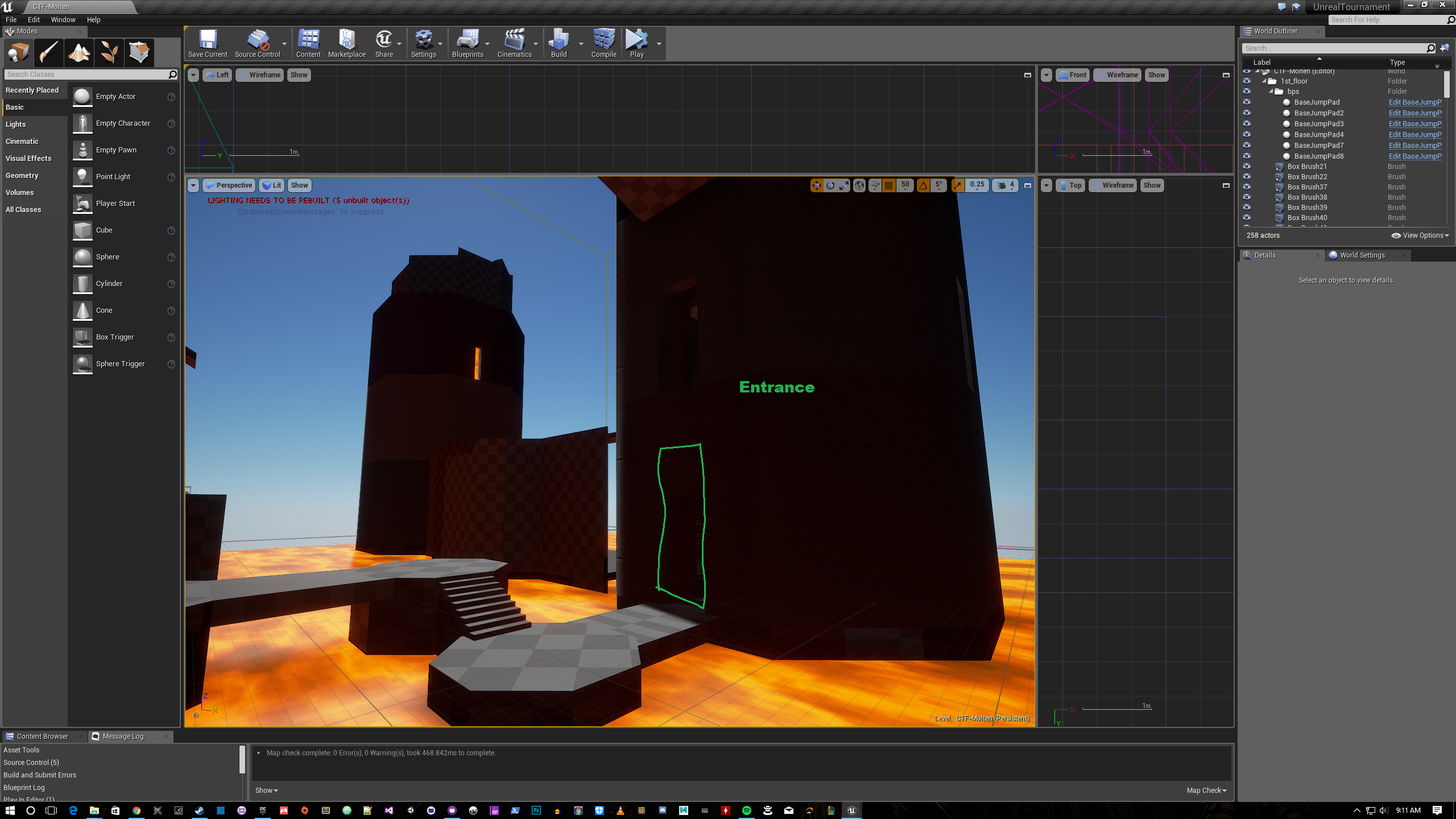
This is a very early screenshot outlining one of the first floor entrances. This image also shows the severe lack of options that the player has once they reach the door. The problem here is that if the player decides to head towards the tower entrance to go inside, the tower’s next rotation could be a wall. Early playtests highlighted this issue with players ending up frustrated that they are completely unable to enter the tower, thinking they would be able to, with the next entrance potentially up to 20 seconds away. In an arena shooter, 20 seconds is three lifetimes for comparison.
I had a few ideas in mind immediately to mitigate these issues to see if they make the experience better: Increase the number of entrances, decrease the time for rotation, decrease the time for idle. Overall the intention was to get people inside the tower quicker, with less time spent waiting. I implemented these very quickly but then had another idea that made the concept more interesting. Large, exterior buttons. The idea was that I could put buttons on the outside of the tower that players could shoot to “force” an entrance the next time the tower rotated. This concept, coupled with the above changes were enough for me to want to playtest again. Another thing that I have added in this build are two, symmetrical hallways on either side of the towers. The idea with the hallways was to provide a longer, more open path for someone to take if they wanted to avoid the tower.
This playtest went very differently: players were avoiding the towers at all costs, using the two hallways instead. Whenever players did go inside of the towers, they died from falling between the static inside and rotating outside shell, never to enter again. Playtesters told me that it was simply the worse option, and too dangerous to use. Players also did not understand the buttons on the outside of the towers. Some general comments were “If I wanted to lose all of my weapons I would use the tower”… Back to the drawing board. I did not want to remove the towers at this point because I still felt that I could make the towers an interesting, and fun gameplay element.
The first fix I implemented was filling the gap between the static inside, and rotating outside. With the tower being avoided as it is, letting players die inside by falling into the lava was something I felt needed to be changed. Some other ideas I had going further with the towers were to put highly valuable weapons and pickups inside the tower areas to lure people inside. I added high-value armor and health, the flak cannon, and finally the redeemer. I also looked at how many entrances I had at the tower’s base with the number of walls I had, 5:3 walls. With this kind of ratio, I was making the map feel very anti-combat. I created more entrances at the base of the tower to end with a 5:3 doors ratio. With these direct entrances added, I had also added another indirect entrance that can be reached using the translocator. Finally, I added another jump pad that is near the left leg of each fort that jumps the players into the center area between the towers. With these changes, another playtest! The intent again with these changes is to get people to go through the center of the map and use the towers.
This playtest went much better, players seemed to feel that the towers were now at least somewhat viable, and were no longer fearing death from the lava on the inside of the towers. Players really loved the jump pad that took them to the center of the map because even though this was the most dangerous route, it was also the quickest if they survived. The part that I liked the most about the jump pad is that if a player was running the flag, they would still need to navigate a tower to cap the flag. This new approach that I took with the towers worked a lot better than previous tests. Using the middle area that players can get to quickly while keeping the area dangerous was very important. Previously players felt that the middle area was both dangerous and slow which felt really bad to play.
A few other small changes were made to the towers but overall design change flow of the rotating towers, and while I do not think this solution is perfect, I am happy I was able to make the worst feature of the map, a unique and somewhat fun feature. I learned a lot about how a player will rationalize their choices based purely on what they see. Convincing a player to do something with gameplay and visuals is very helpful to get them to do what you want. In my case, it was making obvious tower entrances, and creating valuable items for the player to get inside the tower.
FLAG ISLAND. The flag area in the map was intended to be very open, and surrounded by lava, the key theme of the map. Initially, the flag area only had two direct routes to reach the island, while the player could also translocate from many of the areas around it. The two direct routes had the issue of gap distance.
Pictured above is the initial flag island. Gap shown here is measured “perfectly” for dodging onto the island. The problem that I realized very early on is that I left no room for mistakes from the player, a near pixel-perfect jump in 3D space. Through the course of development, I continued to shorten this gap to around jump distance because the areas around this area were usually very combat heavy. This distance decrease felt better overall, and further reduced the number of deaths from the environment. The intent of the environmental hazard was to be for players who take incredibly risky routes and miss a jump or translocator shot.
Another big issue on the map was the island jump pad seen in the image above. This jump pad threw the player directly behind the flag, up inside of the fort. The intention here is that the player who got the flag is taking an eject from the action to get put further back into enemy territory. The issue with this jump pad is that it flings players in the opposite direction they are facing, and is unexpected. This ended with players fighting the fling using air control to fall directly into lava. I realized that I should be making sure that the jump pad will throw players in the general direction they are approaching the pad from. Although there are several maps that feature jump pads throwing players backwards, I feel that there is a better way to achieve what I am going for in this scenario.
The image above is an attempt to fix this issue. The jump pad is pointed toward the 2nd level pipe structure and red side tower, straight ahead. This new jump pad creates a much more expected scenario for where players would end up, and would also put players close to the tower entrance. This furthers the emphasis on using the towers to be the quick path but also emphasizing the risk associated. Secondly, I also created a teleporter on the island, located below the jump pad (accessible from the lower grating). This teleported acted as the means to get to the top of the fort, the previous jump pad location. I players to still be able to reach the top of the fort for both players getting to the top quickly to defend, and also get out of the action if that area is too combative, but going for a slower route. The grating pictured here also makes the island bigger to allow for fewer lava deaths around the flag but to associate a player’s death with their own combat situation, rather than them missing an “easy” jump. This feels better for the player, as falling into the lava feels not so good, especially if it happens again, and again.
The iterations on this flag point taught me a lot about player expectation, in what they see versus what happens on screen. This also taught me a lot about player error, and event interpretation. Making the player feel good for their actions, while diminishing the horrible feeling of their mistakes is very important. Minimizing the number of lava deaths was an important factor on this map.
This is a very small number of problems that I faced when developing this map, and were very fun to iterate on. I will be posting more on this map in the future.
Thank you for reading.