--Spectator Changes (CS:GO)--
#userinterface
I have been working on some changes that I would make to the current CS:GO spectator mode with the goal of making the information more readable to new viewers. The idea here is to be for someone to be able to walk up to the game and understand a few things.
1.Who is winning?
2.When does the game end?
3.Who has the bomb?
Another goal of mine is to not make changes that would upset current viewers of the game, while still being able to reach new viewers. Pictured below is the current spectator mode view that the game uses.
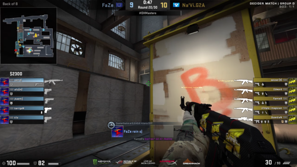
While looking at this, I do believe that the game currently does answer my three questions above, however, I think the questions are answered both indirectly, and weakly conveys the information. A seasoned player would be able to find everything they need rather quickly, but someone who knows what the game is about, but does not understand how the competitive works might have some trouble finding the information to grasp the current standing of the game.
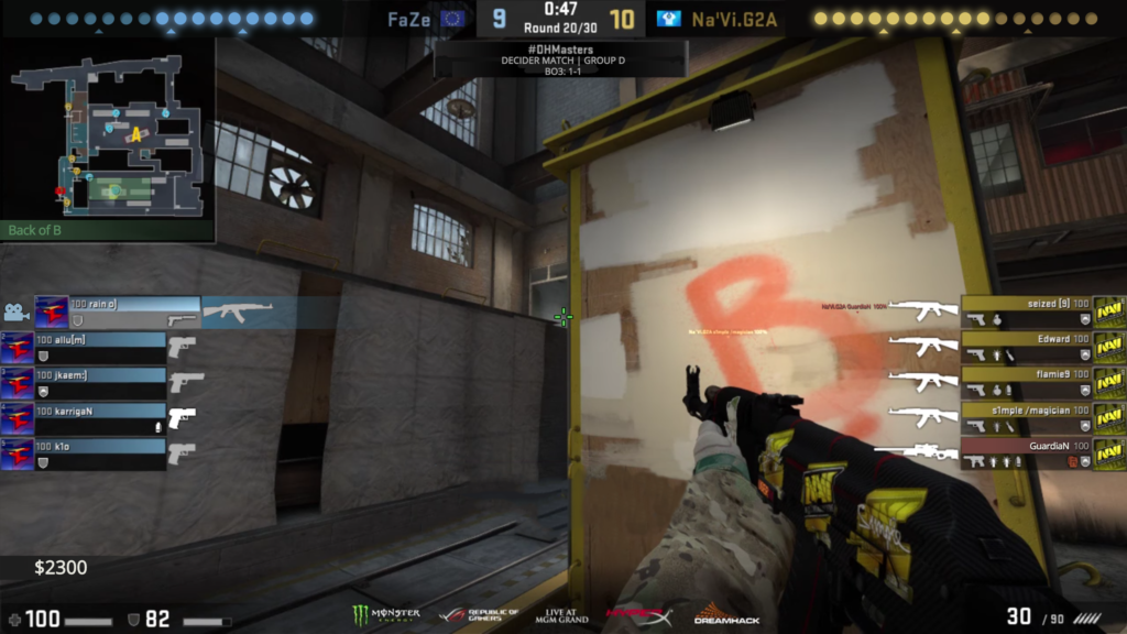
Pictured below are some changes that I think make the spectator mode easier to understand.
The changes here are the following:
1.Lights on the top of the screen to indicate how close both teams are to winning 16 rounds. Once a team reaches the last light they win. I did this because it is currently hard to read when a team wins the game. Indirectly you can tell that the game will end once a team wins more than half of the rounds left in the game. This is a more clear way of showing this. I have also added small triangle indicators to easily distinguish nine lights from ten.
2.After making the above change, the call out location has changed to be below the map in green text. I would rather use the space at the top of the screen for the lights, and take advantage of the available space below the minimap. In addition to this change, I have added a green box that shows what space the call out encompasses on the map. I have done this because not all players may be aware of how far a call out stretches across the map. Additionally, I have moved the match information below the round counter near the top of the screen.
3.The bomb carrier has been directly called out in a couple ways. First, on the screen, he can be seen through the wall of red text instead of the standard yellow-orange. Next, on the scoreboard on the right half of the screen, his nameplate is red, along with the bomb icon. The bomb icon now matches the color of the icon that appears on the minimap and is easier to see in a player’s inventory. Considering the current look, the only way to see the bomb carrier is the small white icon in the player’s inventory and the small icon on the minimap. This solution is clearer however, it is somewhat obtrusive, and may also be confused with a player death.
4.I have moved the player’s current money below the scoreboard as before the money looked like it belonged to the team, instead of an individual.
5.Finally, I have worked on changing the gameplay screen to not have an extra box with the player’s name and weapon skin in the middle of the screen, and have instead gone for calling the currently viewed player on their side of the scoreboard. The callout includes a little camera icon, the nameplate pushed toward the center of the screen slightly, and a slight team color gradient going toward the center of the screen. I have changed this because I thought the extra window near the center of the screen was obtrusive and took away from the game.
I did fumble with some ideas to try to consolidate the currently viewed player information into a single area instead of using the player’s gameplay view, however, I think me altering the HUD too much is dangerous. I risk making it difficult for current players to find information, while also not gaining much in terms of conveying the information better to new players.
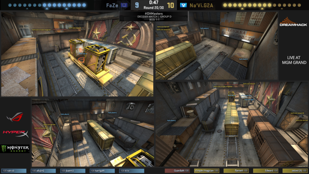
Next up, I have been tinkering with ways to display a firefight differently than from a single POV. This would allow viewers to get an idea of every player’s positioning rather than just an individual. The main idea here is to create multi-cam, room setups. Each map could have cameras set up in the larger, more prominent combat zones, then when the fight starts, the caster can switch to this room’s area camera. An example of what I am talking about is pictured below.
The changes are listed here:
1.Kept the updates to the spectator view in this view for consistency when the caster switches views.
2.Left space for ads on the sides of the screens so the stream could still get revenue from every part of the stream.
3.Divided the views up into angles, with the two bigger frames being much further reaching views.
4.To give an idea of what watching and seeing players on the map, I have placed nameplates on each of the screens.
This view might also benefit being placed with a player perspective in a picture-to-picture manner so that a viewer can switch back to watching an individual and still the have opportunity to switch to a multi-cam view.
Going back to redesigned view, I have made a few final pass changes that simply hammer home certain aspects. Pictured below:

The changes are listed here:
1.Moved the money yet again to be on the lower side of the screen with the rest of the player information. I have done this because it is more consistent with the rest of the player information and looks like it belongs to that individual and is not to be confused with team funds.
2.Added a purple graphic for the player’s current view on the minimap. I have done this because the white, low opacity arch was hard to see on the player, and was even harder to see with the call out rectangle that I added.
3.Made the final light in the scoreboard bigger than the others to signify that something important happens at the end, as well as helps direct which way the lights go.
4.Finally, I changed “BO3” to say “BEST OF 3” because I had space, and is less vague.